What's the deal with align-items: baseline?
I understood all the basic ways flexbox can align content. But I got thrown for a loop with aligning along the baseline.
I can't count the number of times flexbox has made an otherwise painful design layout easy. My only qualm was having to calculate margins and paddings to space elements in a flex container. But now that gap has gotten good browser support, even that's no longer an issue.
But while it doesn't inconvenience me anywhere, it still surprises me.
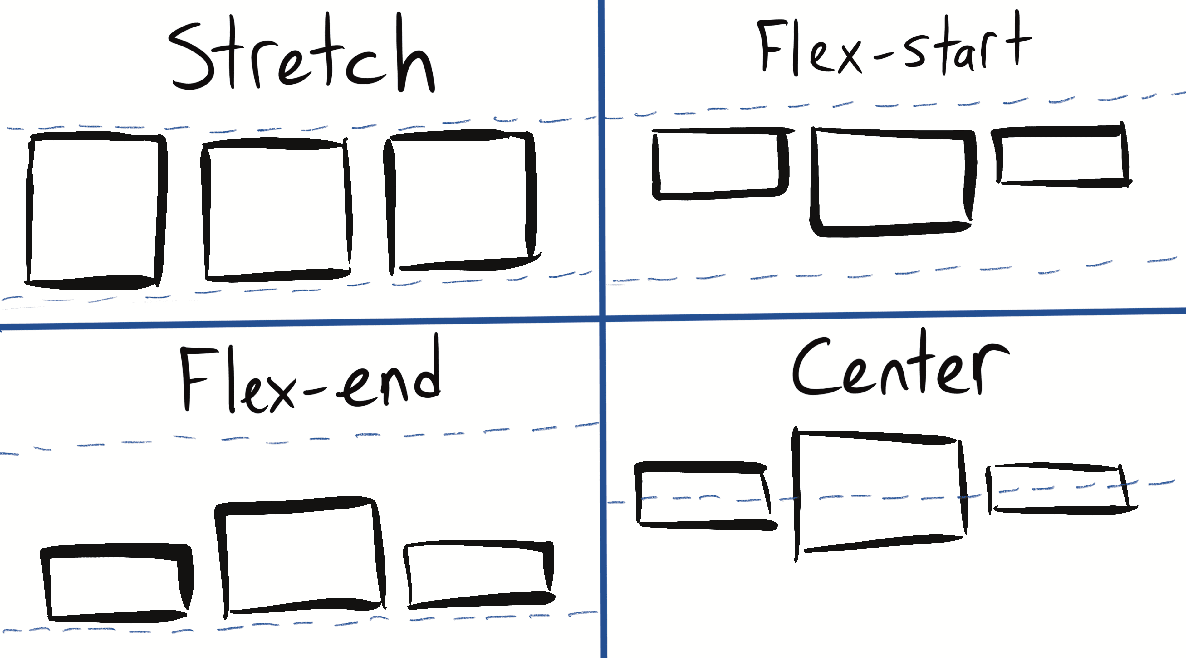
Take the align-items property. When you have a row of items in a flex container, it controls how they line up in that row. I know how the most common values you'd give it work:
stretchis the default value, and it makes each one the height of the tallest element in that rowflex-startaligns each element to the top of that rowflex-endaligns each element to the end of the rowcenteraligns each element along the row's center axis

But an article I read mentioned the baseline value, and I didn't know that one. My own site's article listing is a flex container, so I threw on align-items: baseline out of curiosity.
The result...was unexpected.
I'm not understand why flexbox's "align-item: baseline" is doing this. Can anyone explain it? pic.twitter.com/vJEr5ENHh9
— Max Antonucci (@Maxwell_Dev) October 8, 2021
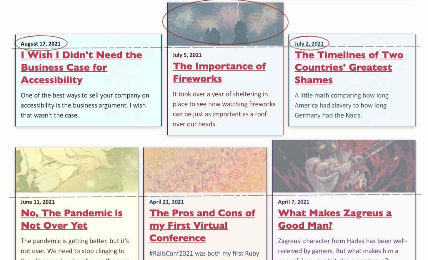
This confused me since the results looked inconsistent. I was guessing flexbox was aligning things by a particular element. But I checked each element and nothing explained the alignment in each row. How could an alignment changed by a single rule give me such random results?
I did a few google searches to find out exactly how baseline aligns content. But I got explanations that were either too sparse or too jargon-filled. So like all confused people with little self-esteem and even less to lose, I turned to Twitter. And I actually got a good answer fast.
Looks like it's aligning the first items' baselines. Images in the first row. Images + dates in the second row. Images again in the third row
— Bryan Robinson (@brob) October 8, 2021
This was the simple answer I'd been looking for! Baseline takes the first element in each flex item, and lines things up by the bottom of that element.
This also explained the inconsistency! Posts in the first and third rows all have images, so it aligned the articles based on the bottoms of those. But the middle row has two posts without images, so it went by the element that was first instead: the dates. So while the alignment rule works, the different elements make it look inconsistent.

It also explains why the layout looks so wildly spaced in some areas. In the second post of the first row, the headline text is larger while the flex-basis is shorter. This pushes a lot of content below the baseline and creates those large gaps in the row.
All this has taught me a few good lessons about when I'd want to use align-items: baseline in the future.
- It's good for content with some size variation. If you have images or text of different sizes,
baselinealways aligns them at the same point. So it can add some consistency where they may otherwise be none. - It's bad for content that has too many differences. It only looks at the first element and not any elements after it. My site has shown that having varying text or elements around a baseline can create lots of empty space.
My recommendation is to use baseline when your inconsistencies stay limited to the first element. Like for a list of cards that always started with headings, but you can't guarantee their font size.
As for my own site, I'm going to stick with align-items: stretch for now. Between optional featured images and different excerpt lengths, there's too much empty space.
But as with all things flexbox, this is good to know.
- Next Post: My 2021 Best Book Awards
- Previous Post: Don't Force It