How to Make an Anime Quote Maker More Awesome
My quote maker remains my favorite code side project. So I can't help but keep adding more controls and features.
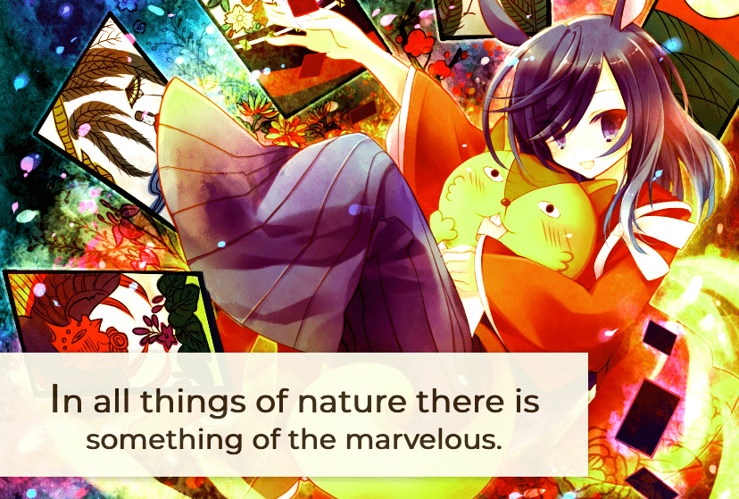
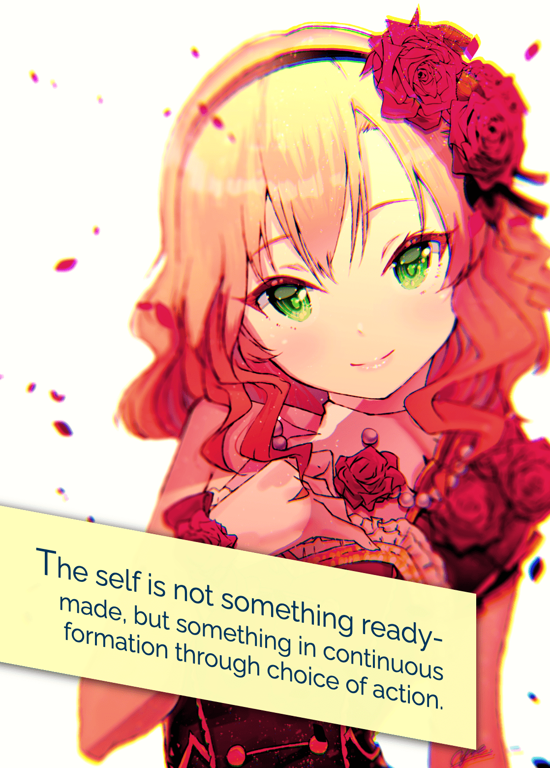
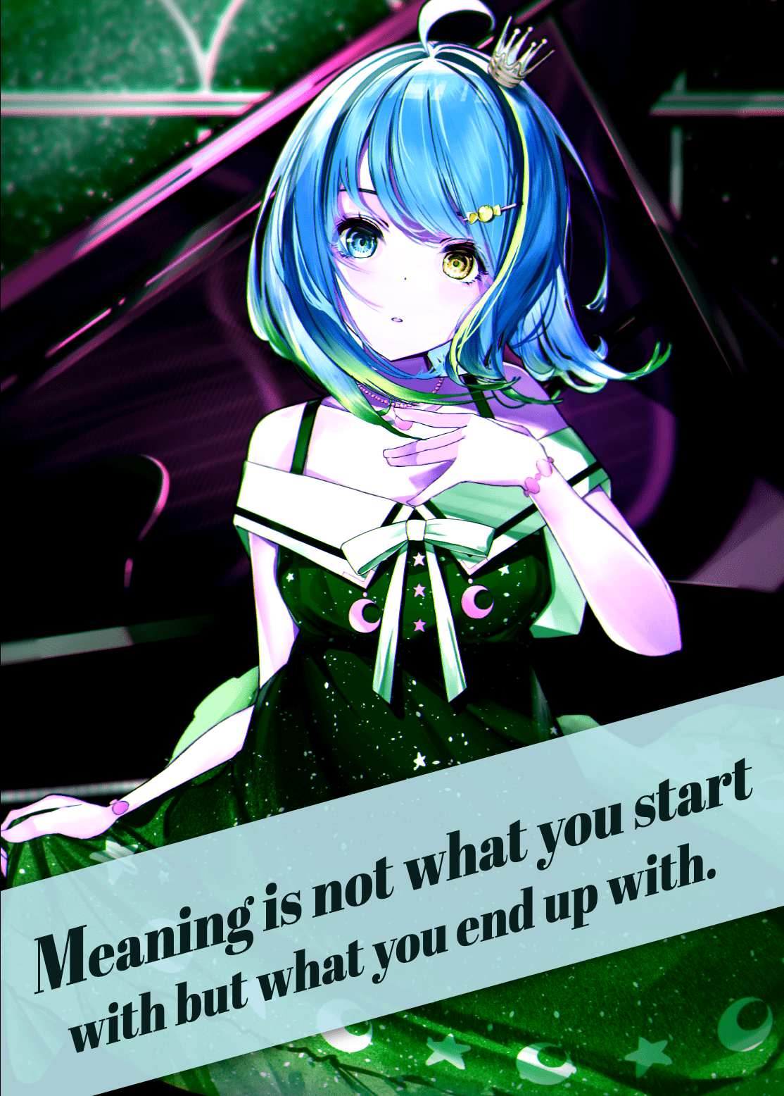
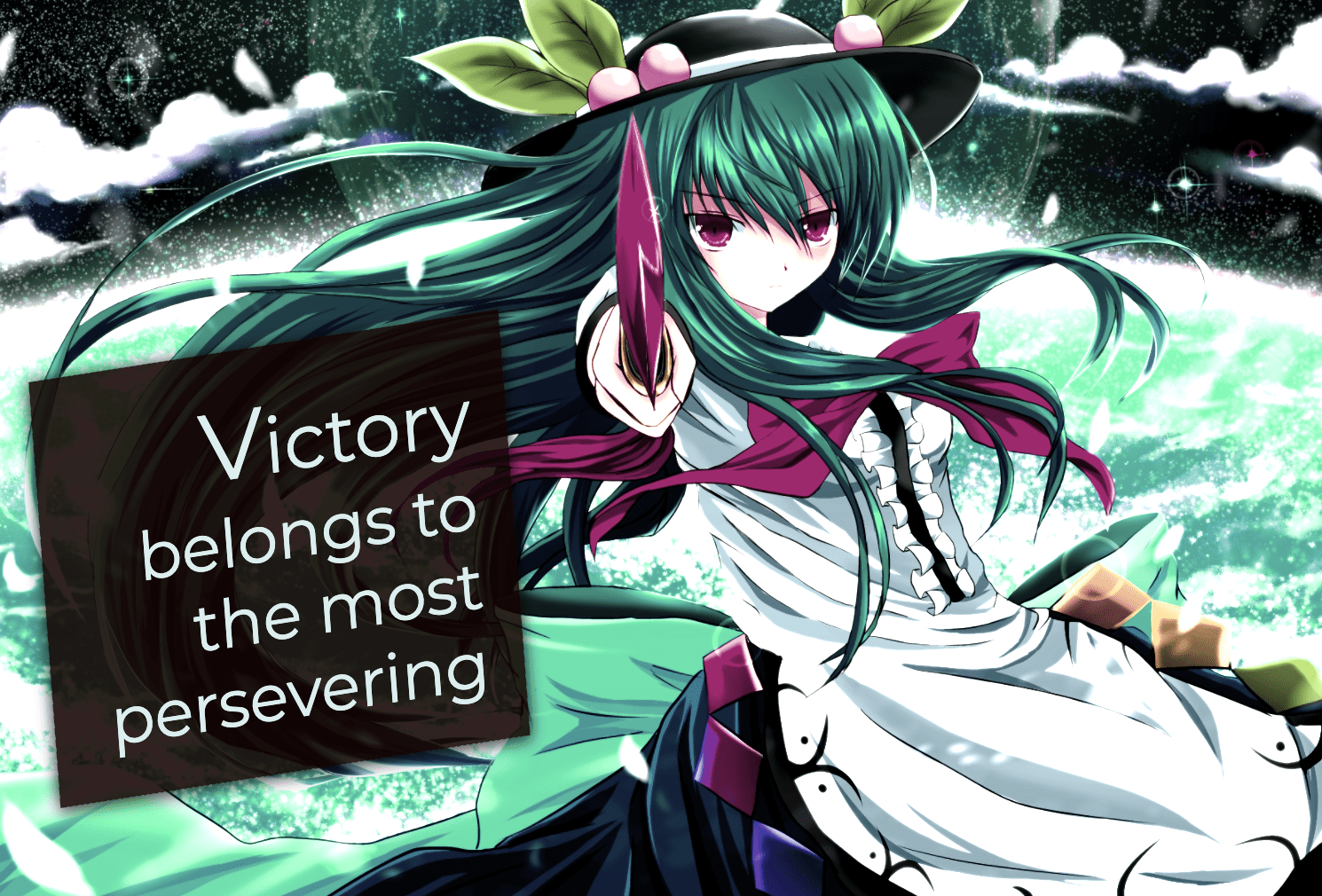
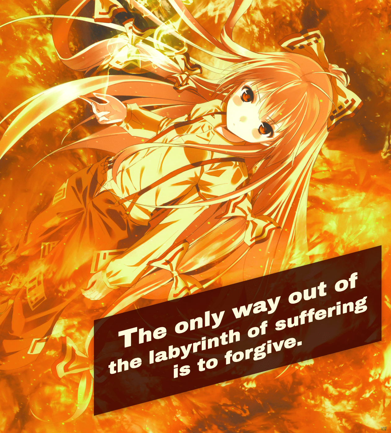
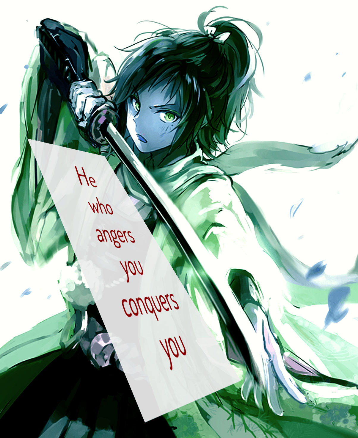
One of my favorite side projects has been my anime quote maker. One reason is, months after making it, I'm still using it to make random art for wallpapers and pull requests. It only takes about two minutes to make something like this:
Another reason is there are many ways for me to get back into and improve it. It keeps my React skills (somewhat) fresh while giving me new ways to improve its potential art.
I made a few of these small but useful changes last week , and I still have more I want to do! But I figured it couldn't hurt to blog about some of the first changes and how they'll help.
More Color Control #
My quote maker makes two random hex color codes for the text and background. The code uses a function I wrote to generate hex codes on the light or dark ends of the spectrum. This gives me randomness as well as proper contrast.
const lightColor  = this.randomColorCode([0, 1, 2, 3, 4, 5]),
      darkColor   = this.randomColorCode(['F', 'E', 'D', 'C', 'B', 'A']);
I made two big changes to how these colors are set up.
First, I flipped the variable names. Until now, I hadn't noticed that the darker color got saved to lightColor and vice versa. Which is more of an embarrassing slip than a bug.
Second, I cut away the hex characters closer to the middle of the spectrum. I noticed many color pairings had enough contrast but were still tough to read. This makes fewer generated combinations possible, but the ones it makes have enough contrast.
const lightColor  = this.randomColorCode(['F', 'E', 'D', 'C']),
      darkColor   = this.randomColorCode([0, 1, 2, 3]),
Another thing that bothered me was what I wanted for foreground or background colors. I'd often want one with a light background but kept getting a dark one, or vice versa. It was frustrating when I liked the colors, but switching them myself was too much of a pain.
To solve this, I only needed a function to swap the two colors.
flipColorCodes = () => {
  this.setState({
     textColor: this.state.bgColor,
     bgColor: this.state.textColor
  })
}
I passed this into a new button in the UI and it worked perfectly. Color me surprised that I still remember React's basics this well.
Updating the Quote Size #
I have two goals for changing how I adjust the size of the quote itself:
- Use slider inputs for a more intuitive way to change the values.
- Have some preset sizes for quick checks of what works best.
Before the update, functions to update the width and height only worked when passed to inputs. They take the input event and pull out the typed value.
updateWidth = (e) => this.setState({ width: e.target.value });
updateHeight = (e) => this.setState({ height: e.target.value });
But I want them to also work when connected to button clicks. So they need to check if they're given an input event or not, and either uses that or a regular argument's value.
I can do this with a simple ternary check. This is much shorter than my first version that passed an extra "is this custom?" argument that added almost ten extra lines (and far less painful to read).
updateWidth = (e) => this.setState({ width: e.target ? e.target.value : e });
updateHeight = (e) => this.setState({ height: e.target ? e.target.value : e });
Change Inputs from Numbers to Ranges #
The old inputs for changing the quote size were basic number inputs.
<label>
  Width:
  <input type="number" name="width" value={width} onChange={updateWidth} />
</label>
This lets me set the dimensions, but only if I knew the exact size I wanted. But more often, I was making one larger or smaller without a specific number in mind. I just went until the size was a good fit for the image. This made resizing quotes a tedious chore.
But the glory of HTML is it has a native range input already! I was worried I'd go down a rabbit hole of importing a React component, but there was no need. I only had to link the same variables and functions to the markup. This includes setting the value ranges, adding classes, and showing users the width.
<label className="qig-l-slider__label">
  <span>
    Width: <strong>{width} pixels</strong>
  </span>

  <input type="range" min="300" max="1200" name="width" value={width} onChange={updateWidth} />
</label>
Intuitive quote sizing GET!
Creating Preset Quote Sizes #
Now I want to add those buttons for preset quote sizes. They're the whole reason I updated those functions, after all. I needed a button click to call both updateHeight and updateWidth.
I was glad I didn't need to create separate functions to call them both, then pass them to the button elements. But that would mean having my stateless "change size" component do more than hold markup. I want to keep it as simple and stupid as possible.
But as it turns out, you can pass many functions to a button's onClick event with no problem. I only had to put both of them in an anonymous function. This makes adding, editing, and removing preset sizes easy.
<div>
  <button onClick={() => {updateHeight(700), updateWidth(700)}}>
    Square
  </button>

  <button onClick={() => {updateHeight(500), updateWidth(800)}}>
    Landscape
  </button>

  <button onClick={() => {updateHeight(800), updateWidth(500)}}>
    Portrait
  </button>

  <button onClick={() => {updateHeight(667), updateWidth(375)}}>
    iPhone 8
  </button>
</div>
You may ask why I added the iPhone 8 and nothing else. It's because that's my phone model, and I have no illusions that few others (if any others) use this app. So I'll save adding any other device sizes for when I get any requests for them. You can send any requests to me via Twitter, Github, or puppy-based mail delivery service.
I also updated the quote maker's image alignment and font size UI. Now they use range inputs since I also use my intuition to change them until they fit the image. But those changes were the same as the ones for the sizes, so I won't go into detail.
Instead, to the biggest change of this post!
Quote Position Control #
This is where my updates started to get complicated. I wanted to let users have precise control over where the quote gets placed on an image. As in, pixel-by-pixel adjustments in any direction.
Setting up Absolute Positioning #
The old version used CSS Grid with some pre-written classes to control the location. This was easy to manage since I only needed to change one class was being added to the quote wrapper. But this limited it to about a dozen or so layout options. I could add more, but Grid could never give me the precise control I wanted. So I needed to use absolute positioning and inline styles.
I was actually already adding inline styles to the quote for text alignment and color. So I moved a few div elements around to remove the Grid wrapper and added more inline styles for the positioning.
const quoteStyle = {
		// New ones!
   'top': isNaN(top) ? 'auto' : `${top}px`,
   'right': isNaN(right) ? 'auto' : `${right}px`,
   'bottom': isNaN(bottom) ? 'auto' : `${bottom}px`,
   'left': isNaN(left) ? 'auto' : `${left}px`,

		// Old ones
   'textAlign': alignment,
   'fontSize': `${size}px`,
   'fontFamily': fontFamily,
   'backgroundColor': bgColor,
   'color': textColor
}
You may ask why I need the not a number (isNaN) checks there. That's because I often don't want to set the absolute positions for all four sides. So if I want the quote to start at the top and flow down naturally, I can't have any bottom position values. This makes it so bottom goes to auto and gives the layout effect I want.
So the quote box is ready to accept some absolute values. The hard part is bringing them to it.
Adding Sliders for the Quote Position #
The quote maker will need to track these different position values, so adding them is a good place to start. I added these to the quote maker's state with some default values. These are saved in a separate file (there's a lot of states to manage, no surprise), so I'll only list their names and values.
quoteTop: 'auto',
quoteRight: 0,
quoteBottom: 0,
quoteLeft: 0,
The quote maker also needs some basic functions to manage them. These are the same as the updater functions I edited for the quote positions. They should work with both input and direct values.
updateQuoteTop = (e) => this.setState({ quoteTop: e.target ? e.target.value : e });
updateQuoteRight = (e) => this.setState({ quoteRight: e.target ? e.target.value : e });
updateQuoteBottom = (e) => this.setState({ quoteBottom: e.target ? e.target.value : e });
updateQuoteLeft = (e) => this.setState({ quoteLeft: e.target ? e.target.value : e });
Now I have these values and the functions for updating them. Next I need to pass them (and a few others) to the Position component. It holds the UI for viewing and changing them.
<Position
	quoteTop={this.state.quoteTop}
	quoteRight={this.state.quoteRight}
	quoteBottom={this.state.quoteBottom}
	quoteLeft={this.state.quoteLeft}
	updateQuoteTop={this.updateQuoteTop}
	updateQuoteRight={this.updateQuoteRight}
	updateQuoteBottom={this.updateQuoteBottom}
	updateQuoteLeft={this.updateQuoteLeft}

	verticalLimit={this.state.height}
	horizontalLimit={this.state.width}
	allPositions={this.allPositions}
	updatePosition={this.updatePosition}/>
You may wonder what those last four arguments are for. I'll explain them in a bit to build the suspense and dramatic tension.
Over at the Position component, I had to swap the layout radio buttons with more sliders. But as you can see, these range inputs are more complicated than the ones for the positions.
Here's what the one to change the top position looks like.
<div>
  <label htmlFor="posTop" className={`qig-l-slider__label ${isNaN(quoteTop) ? 'qig-l-slider__label--disabled' : ''}`}>
    <span className="qig-l-slider__label-inline-text">
      Top:
      {isNaN(quoteTop)
        ? <strong>None</strong>
        : <input type="number" min="0" max={verticalLimit} value={quoteTop} onChange={updateQuoteTop} />
      }
    </span>
    <input type="range" min="0" max={verticalLimit} name="posTop" value={isNaN(quoteTop) ? 0 : quoteTop} onChange={updateQuoteTop} />
  </label>
  <button onClick={() => updateQuoteTop('auto')}>
    Set to None
  </button>
</div>
Yeah, that's a lot. I'll go one step at a time. There are only two main differences between the other range input and this one:
- The
maxattribute depends on the limits I passed into the component before. Users can change the quote's size, and that affects how far they can move the quotes in their respective directions. So those sizes need to act as limits. - If the value is set to
autoor any non-number, the value falls back to0to go on the image's edge.
There's also how the current position value gets shown in a number input here. It's odd, since wasn't this change to get rid of these number inputs?
{isNaN(quoteTop)
  ? <strong>None</strong>
  : <input type="number" min="0" max={verticalLimit} value={quoteTop} onChange={updateQuoteTop} />
}
That's here because I realized quote positioning needs both broad and precise adjustments. I may move the top value around on the slider to get a basic position right. Then I'll use the number input to tweak it right where I want it.
I also added the "Set to None" button since I realized I can use the slider to add a position value, but it couldn't remove it. So it assigns the position a value of auto to remove all positioning. The ternary operator lets me use the function here as I did with input.
Last, I added a conditional class to the label, qig-l-slider__label--disabled. If there's no value, this dims the range input without disabling it. This makes it easy for users to understand what values are and aren't set, but are still easy to adjust.
Take all this, and repeat it for the right, bottom, and left positions. With that, I have precise control over where the quote goes!
Adding Preset Quote Positions #
This kind of control is great, but I don't want to lose the ability to use preset positions. They're great for trying a bunch of layouts, seeing which is best, and adjusting it until it's right. So that's my last hurdle to get this going.
Separate from the quote maker component, I defined several "position" objects. They'll have a label and a set of values. I want their format to simple and easy to manage.
{
  'value': {
     'top': 'auto',
     'right': '0',
     'bottom': '0',
     'left': '0'
  },
  'label': 'Bottom '
}
Once I had an array of these position objects, I put them in a big array. Then I saved them to the quote maker in the allPositions variable. Yes, that's the unexplained variable I passed to Positions before! I have fired Chekhov's gun and I'm certain you're amazed.
But what about the updatePosition function? That's what I'm using to update all the state's position values. I only need to set all the right values for the quote maker's state.
updatePosition = (position) => {
  const { value } = position;

  this.setState({
     quoteTop: value['top'],
     quoteRight: value['right'],
     quoteBottom: value['bottom'],
     quoteLeft: value['left']
  })
}
With both of these passed to the Positions component, adding them to the UI is easy. I loop through each position object in allPositions. Each loop renders a button with its label and calls updatePosition with its values.
<div className="qig__long-buttons-wrapper">
  {allPositions.map((position, i) =>
    <button key={i} onClick={() => updatePosition(position)}>
      {position["label"]}
    </button>
  )}
</div>
Bam! With that, I can click any of those buttons and get the presets! All I need to do to add new positions is add a new object to the array where they're stored. It's a simple way to add a lot more creative positioning potential to all my quotes.
Wrapping Up #
This post went longer than I expected, and that's not even everything! I've since made more updates to how I add filters, transforms, and perspective. But this is already plenty to cover and has made making new quote images faster and more intuitive. All these extra controls have made it easier to set up quotes and show off their art.

Expect even more changes to the quote maker later on. They're only going to get more ambitious.
- Next Post: Don't Let Your Hobbies Burn You Out
- Previous Post: The Pros and Cons of my First Virtual Conference